Discover
Many insights were gained during this period due to conducting multiple empathy interviews, desk research on the target audience, app map iterations, and a competitor analysis on other life-improvement apps.
We did extensive research to get a thorough understanding of our target audience — this ranged from burnt-out doctors, to smoking addicts, to a self-conscious college student. Research on other lifestyle apps was also conducted for heuristic evaluation.
App Map Iterations: LifeCycle's original app map did not provide a clear end goal for the user. With this in mind, we sought to make this complex flow as simplistic as possible — essential for users who are likely already stressed out from their offline world.
Competitor Analysis: These apps (Fabulous, Flora, Structured) all have their own unique features, ranging from making self-care a game to a more list-like approach. Some had a decent range of options targeting various aspects of life improvement, but not a user-centered method — this is where we sought to find a solution.
Personas
- A good support group
- Way to organize highs and lows
- To learn good conversational skills
- To learn how to have fun
- To remember when to eat
- A way to get organized
- To feel comfortable with himself
- A way to quit smoking
- To balance school and social life
- To stop being hard on herself
- Not stress about the future
- Lighten up on herself
- Give herself more credit
Persona portraits are placeholders — swapped out from the original photos for this rebuild.
MVP
We concluded that users needed to find recipes depending on what is available, and a way to track the habit being perpetuated.
From our findings based on our user research and affinity maps, we noticed that everyone knows what the right thing to do is — but they lack the resources to achieve it.
HMW
Major insights from our findings with the user personas, journey maps, and HMWs led us to conclude that LifeCycle's user experience and interface needed an overhaul. The heuristic evaluation confirmed it was difficult for users to navigate and didn't cater directly to the specific needs of the app's users. Three specific features were designed for each persona's specified needs: Nutrition, Affirmations, and Habit Tracking.
Ideate — Wireframe Sketches
My team and I created various sketches of the user interface to get a feel for what the layout would display. Detailed sketches were kept to a minimum in order to fully grasp whether the flow could be usable.
The mid-fidelity prototype was created simultaneously as user testing was conducted — live in-person observational testing as well as non-observational feedback through a survey after the user completed the flows. The demographic of testers ranged from children (age 12) to college students (18–21), millennials (35), and boomers (58–66).
Design motif, typefaces, and overall UI design were heavily explored during this step to create not only a usable but also a delightful experience for LifeCycle's features.
Design & Development
Heuristic Design: The goal of LifeCycle is to help people, so we needed to make it more people-friendly while also aesthetically pleasing.
Design Principles:
- Communication — Can reach out to friends.
- Modularity — Each section is part of a larger system.
- Intuitiveness — Color-coding and navigation systems that are seamless.
- Inclusivity — Keeping people of different backgrounds and needs in mind.
Deliver — The Features
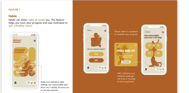
Habits
Habits can either make or break you. This feature helps you track your progress and stay motivated to quit unhealthy habits.
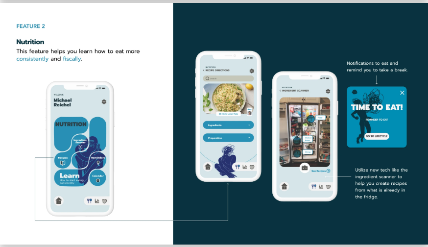
Nutrition
This feature helps you learn how to eat more consistently and fiscally — including an ingredient scanner to build recipes from what's already in the fridge.
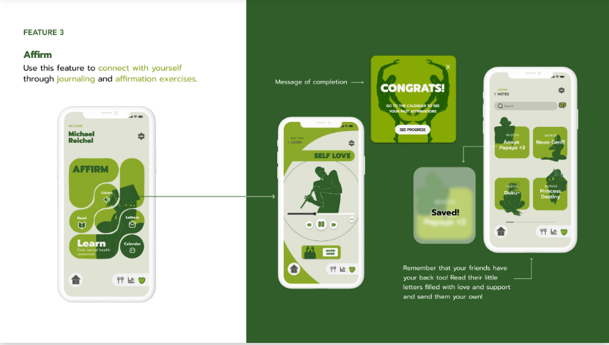
Affirm
Use this feature to connect with yourself through journaling and affirmation exercises — including sending your own written support to friends.